Colour in the bathroom: Not all whites are the same
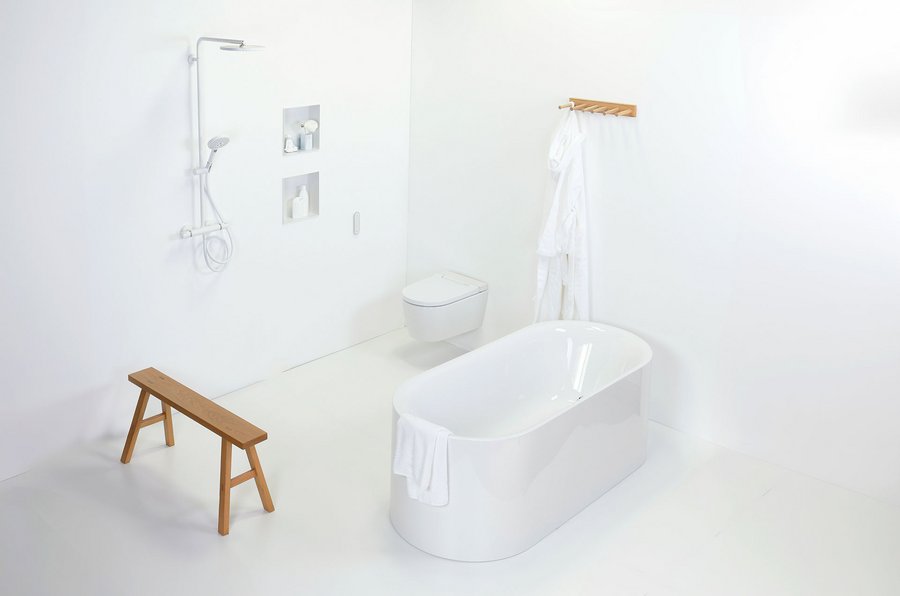
Differences in white tones in the bathroom: professional bathroom planning leads to a perfect overall experience.
Photo: FAR.consulting, Vereinigung Deutsche Sanitärwirtschaft e.V. (VDS)
Differences in shades of white are a challenge when planning bathrooms. And although some shades of white have become something of a standard here, it is good to know what factors play a role in colour planning with white and why bathroom planners should work with original samples wherever possible. With Pantone's colour of the year for 2026, a special shade of white is currently coming into play: Cloud Dancer.
White is an indispensable colour in the bathroom: sanitary ceramics, mineral cast washbasins, walls, even tiles... white dominates the bathroom as far as the eye can see. Even white surfaces are en vogue for fittings. However, from a design perspective, this achromatic ‘non-colour’ (physically speaking, it is the result of adding all visible light colours) is highly sensitive: no other colour stands for purity and purism to such an extent; however, as every shade of white has a subtle colour nuance, differences between neighbouring shades of white can be particularly distracting. Small deviations in material white and light colour are enough to make the interior design appear restless, ‘dirty’ or cool and technical. For professional bathroom planners, it is a challenge to control white in a targeted manner – on surfaces, joints, sanitary objects, accessories and lighting. Now another shade of white is being added, the Pantone trend colour of the year 2026 PANTONE
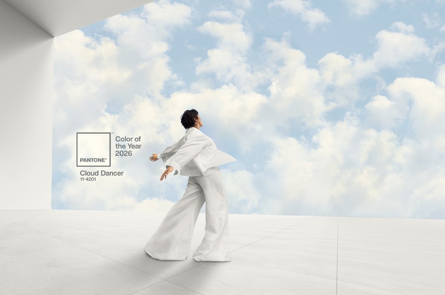
11-4201 Cloud Dancer.
Cloud Dancer – Pantone Trend Colour 2026
Poto: Pantone
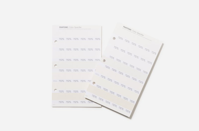
Pantone, a global colour expert and provider of professional colour standards and digital solutions for the design community, introduced PANTONE 11-4201 Cloud Dancer at the end of the year, a weightless white tone designed to convey a feeling of deep serenity. According to the colour expert, the delicate white shade is intended to symbolise calm in a hectic world that is rediscovering the value of mindfulness and quiet reflection. The colour specialist is well aware of the importance of this colour family for long-lasting interior design: Cloud Dancer is intended to convey a feeling of calm and relaxation, especially in the bathroom, while in the kitchen, the shade is designed to create an impression of openness and space. Unfortunately, no further information about colour nuances can be found in the press and marketing materials; when looking at the numerous examples, one can only guess at what the shade actually looks like. Professionals will therefore probably have to decide to purchase the sample cards.
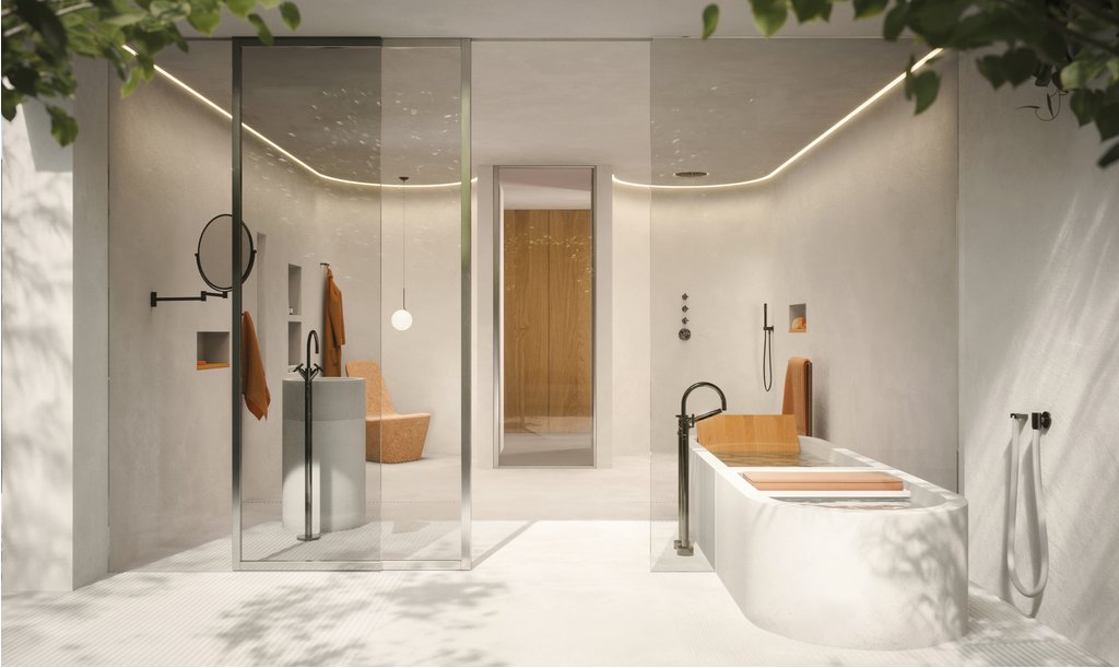
Purist to ethereal: cosy all-white interiors for bathrooms are currently in vogue
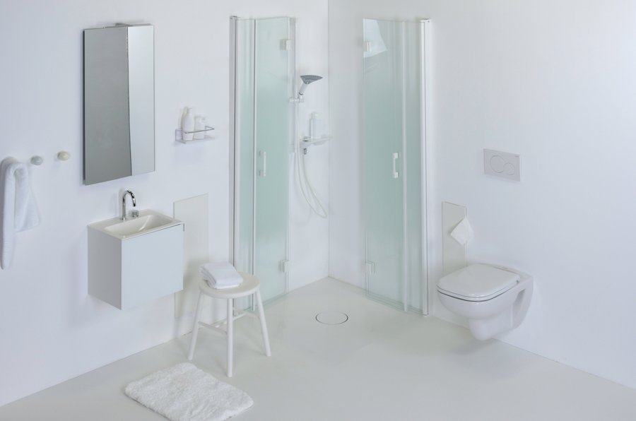
Photo: FAR.consulting, Vereinigung Deutsche Sanitärwirtschaft e.V. (VDS)
No sooner does white seem to face serious competition as the dominant colour in bathrooms, ranging from neutral concrete greige to natural light beige, than it is rediscovered as a trend colour. The first impression of Pantone's colour of the year for 2026 is that Cloud Dancer could be a white with a tendency towards a beige tone and is intended for combinations with greige and grey tones. This would make it perfect for adding a cosy touch to the interior design of the bathroom. The fact that Pantone has chosen a shade of white as its colour of the year speaks for the topicality of the colour when used in an original way.
Trendy interior design concepts that seek to break down boundaries in rooms through low-contrast, emphatically matt tone-on-tone designs naturally also find a particularly suitable stage in the bathroom. A room designed in white-on-white or all-white is likely to have an almost ethereal effect – an idea that fits very well with the name ‘Cloud Dancer’ for Pantone's trend colour for 2026. However, it is questionable whether sanitaryware manufacturers will take up the colour expert's idea and offer sanitaryware products in matching shades. The new trend colour gives bathroom designers a new approach to trend-conscious planning, but no certainty. The uncertainties surrounding the major design theme of white therefore remain. The only certainty is that white will remain a strong base colour – with a new, trendy perspective.
White in the bathroom: opportunities and risks
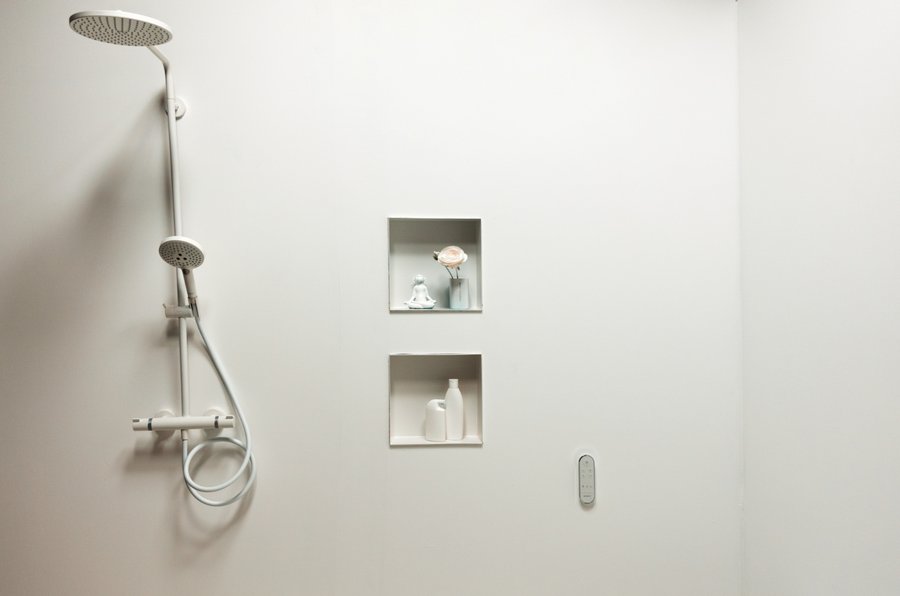
Photo: FAR.consulting, Vereinigung Deutsche Sanitärwirtschaft e.V. (VDS)
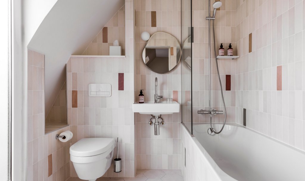
There is, of course, a history behind the fact that white has dominated bathroom design since sanitary facilities were first installed in homes. Not only did white become a prestigious material with the introduction of sanitary ceramics in the late 19th century, but white also conveys hygiene, clarity and visual spaciousness. At the same time, the colour provides a neutral environment for personal hygiene and cosmetics. One might think that a basic colour present in various products and applications would make uniform design much easier. However, in highly reflective rooms such as bathrooms, even minimal colour variations are amplified; even slight nuances in tiles, ceramics or fronts stand out clearly in the overall picture.
For interior designers, this means that white is less a colour than a system of tones, degrees of gloss and lighting moods that must be planned consistently. If this system is neglected, the impression quickly shifts from ‘clear’ to ‘clinical’ or from “fresh” to ‘yellowed’.
Different shades of white from sanitaryware manufacturers
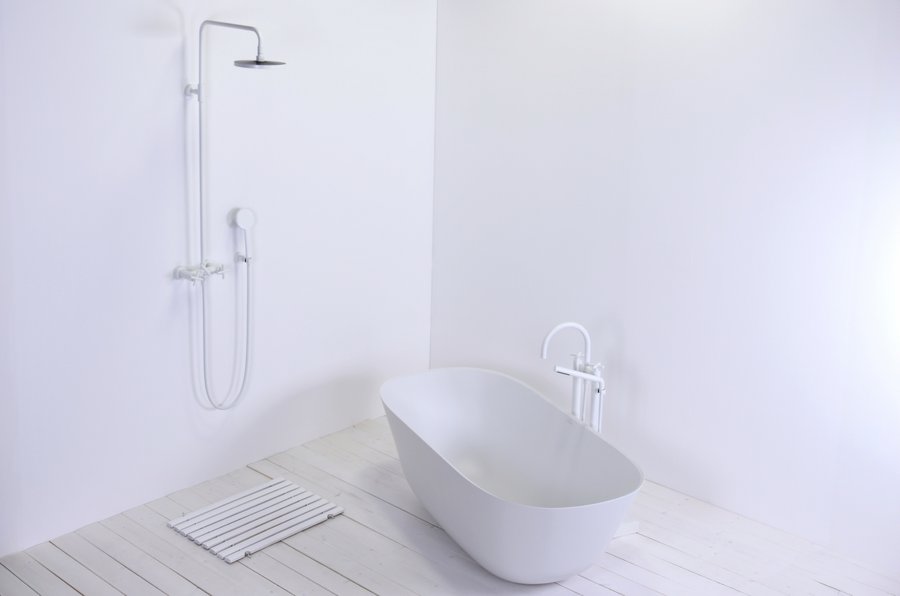
Photo: FAR.consulting, Vereinigung Deutsche Sanitärwirtschaft e.V. (VDS)
Every manufacturer seems to define its own ‘standard white’, which can range from cooler, bluish shades to warmer, cream-coloured nuances. Combining sanitary ceramics, tiles, furniture and ceiling paint from different brands without coordination results in visible discrepancies – such as greyish ceramics against light ivory-coloured wall tiles. Even within a manufacturer's product range, there may be different shades of white. As a rule, the shades of white within a manufacturer's range always match each other better and are precisely coordinated. A sanitary ceramic toilet and a matching toilet seat made of plastic (Duraplast) then look as if they were made from the same mould. Professional bathroom planners plan with these product combinations per se or, in the case of colour-sensitive products, fall back on manufacturer collections.
In practice, it helps to physically compare shades of white for each project rather than relying on sample cards in catalogues or images on screens. It makes sense to have a clear strategy, such as choosing a dominant basic white for all large surfaces, complemented by a maximum of one contrasting accent white (e.g. for furniture) with a recognisable, deliberate difference.
Current standard: sanitary white / alpine white

At Geberit, the toilet seat, sanitary ceramic toilet and flush plate are colour-coordinated to match each other perfectly.
Photo: Geberit
By far the most common colour is ‘Alpine White’ or ‘Sanitary White’; estimates suggest that this shade is used in the vast majority of white sanitary ware installed in Germany. Alpine white is a relatively neutral, slightly warm white that has been specially defined for bathrooms and is similar in appearance to common architectural white shades such as RAL 9010 or similar nuances. Some sanitaryware manufacturers also offer variants such as ‘glossy white’, ‘snow white’, “edelweiss” or ‘pure white’, all of which fall within this spectrum but differ slightly in brightness and temperature. Important for bathroom planners: the names are not standardised, so original samples from different brands should always be compared directly with each other.
Role of gloss level and materiality
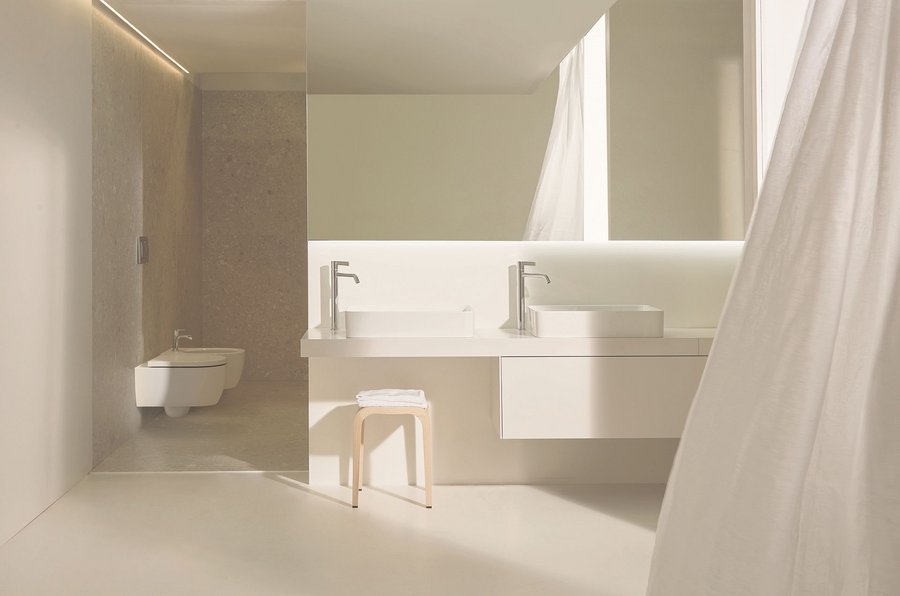
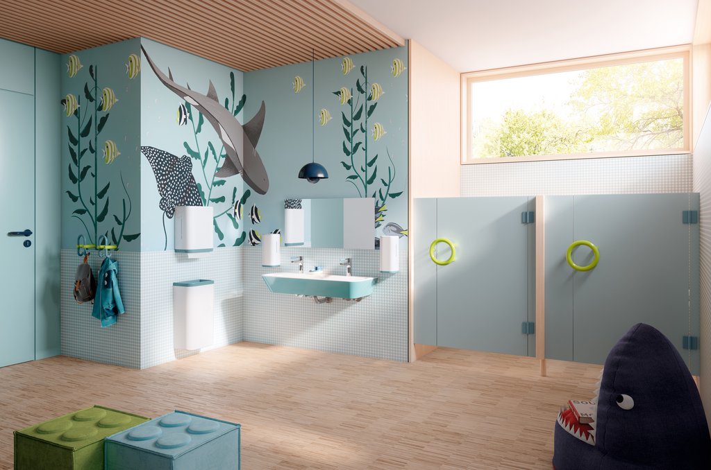
Shades of white are currently in vogue and create space for structure and clarity in modern living environments.
Photo: Villeroy & Boch
The degree of gloss and surface structure influence the perception of white almost as much as the colour tone itself. High-gloss tiles reflect light in a concentrated manner and amplify colour temperature deviations, while matt surfaces make white appear softer and more homogeneous. The currently popular 3D tiles refract light and provide another source of error when evaluating a colour impression.
In the bathroom context, different materials also collide: glazed ceramics, lacquered fronts, solid surface materials, lime plaster, mirrors and glass. An identical NCS, Pantone or RAL value has a different effect on each of these substrates, which bathroom planners should take into account when sampling with 1:1 samples.
Light temperature of bathroom lighting
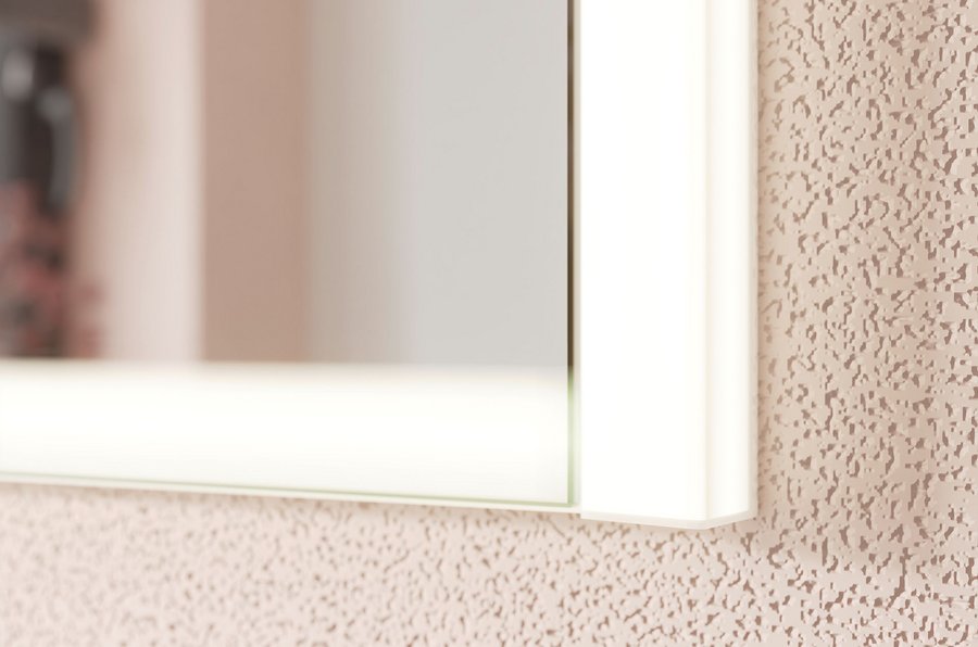
Adjustable light temperature: rl40 mirror cabinet by Burgbad
Photo: Burgbad
The light colour of luminaires is specified in Kelvin and typically ranges from warm white (approx. 2,700–3,300 K) to neutral white (approx. 3,300–5,300 K) to daylight white from approx. 5,300 K for white light sources. Warm white light tends towards yellow and quickly makes white surfaces appear creamy or slightly beige; neutral white and daylight white, on the other hand, emphasise cool, bluish tones.
Especially in the bathroom, where skin tones and the colour rendering of cosmetic products are important, neutral white in the range of approximately 3,500–4,500 K often appears more balanced than extremely warm or cool white. Light that is too cool can make the room appear ‘hygienically bright,’ but at the same time uncomfortable and unflattering for the mirror area.
Lighting design in the bathroom: daylight and mixed light
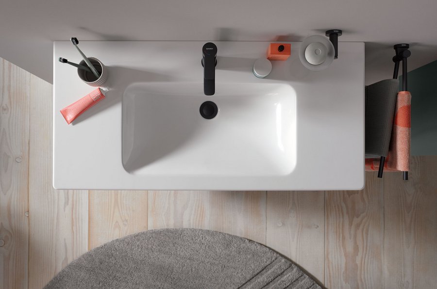
Targeted lighting design in the bathroom: coordinated light temperatures and flexible control instead of universal lighting.
Photo: Duravit
Natural daylight changes its colour temperature significantly depending on the time of day and weather conditions: in the morning and evening, warmer, reddish tones around 3,000 K predominate, while the midday sun reaches values of around 5,500 K and above. A clear blue sky can even produce higher, very cool light temperatures, which make white appear significantly bluer.
In bathrooms, mixed light from daylight and artificial light is almost always present, which constantly changes the effect of white surfaces. Planners should therefore not rely solely on a ‘universal’ luminaire, but should specifically control the lighting atmosphere with coordinated colour temperatures, dimmable or tunable white systems and differentiated switching.
Design strategies for professionals
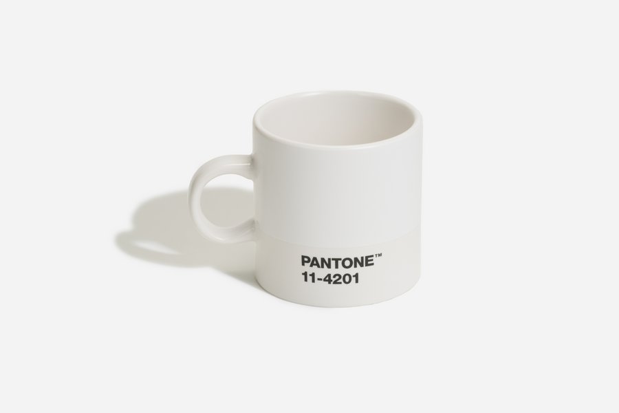
Photo: Pantone
Define a uniform white base: Set a main white (tiles/walls) as a reference and explicitly check all other elements – ceramics, furniture, joints, ceiling – against it.
Conscious contrasts instead of random nuances: If different shades of white are unavoidable, they should be clearly differentiated (e.g. warm off-white for furniture with cooler, clear wall white) instead of varying only minimally.
Think integratively when planning lighting: for functional lighting above the mirror, use a neutral white in the range of approx. 3,500–4,500 K, and provide warmer zones for ambient lighting. Some mirrors and mirror cabinets also offer light temperature control, which allows for more flexibility in bathroom planning when it comes to colour design.
Check your plans in real light: view sample surfaces not only in the showroom, but also on site in real daylight and with artificial lighting switched on in order to reliably assess the effect of white and light.
The colour white is essential in the bathroom
With this approach, white in the bathroom transforms from a risky colour into a deliberately controlled design tool that combines brands, materials and light to create a professional overall experience. PANTONE 11-4201 Cloud Dancer could play an important role in bathroom wall and floor design as a first step. ‘With the Colour of the Year 2026, Pantone wants to focus on the symbolic emptiness of the canvas that Cloud Dancer embodies,’ according to Pantone's marketing message. For precise bathroom planning, it is always advisable to coordinate colours for specific objects: the series name and exact ceramic colour of the manufacturer should be documented and all adjacent white tones (walls, furniture, bathtubs, radiators) should be visually checked against it.
