Interview with designer Gesa Hansen: “I’ve never got sick of trees being green."
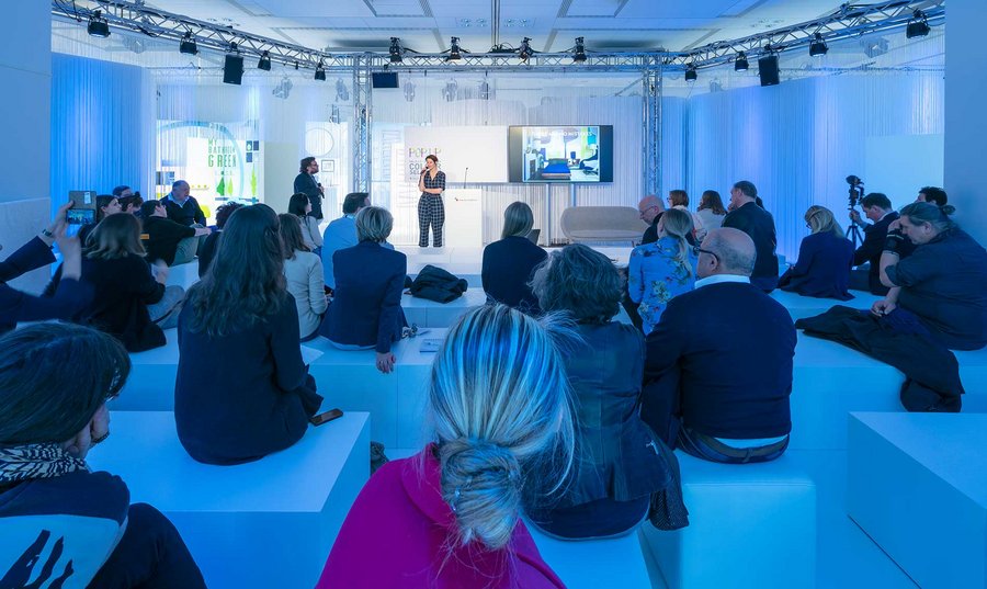
Photo: Constantin Meyer, Vereinigung Deutsche Sanitärwirtschaft e. V.
Background: far.consulting, Vereinigung Deutsche Sanitärwirtschaft e. V.
This year’s ISH trade show in Frankfurt made one thing clear: the end of
colour abstinence in the bathroom postulated by the Pop up my Bathroom trend
experts has come. Manufacturers, bathroom planners and consumers
are still a little cautious when it comes to bathroom concepts in vibrant
colours, trendy colour combinations or pastel arrangements. At the
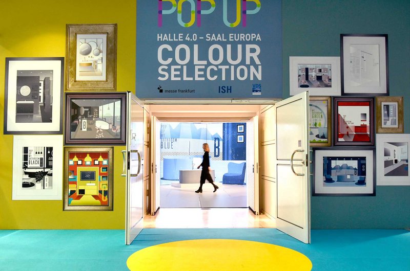
exhibition staged by the sanitary industry’s Pop up my Bathroom trend platform,
visitors could see which colour concepts are suitable and feasible for the
bathroom.
No sooner has black-and-white established itself as a trend than colour
accents are starting to reappear. The mix-and-match approach that is
giving rise to brightly painted vintage pieces in the living room or
accent-colour shelves in the kitchen often has long-lasting consequences in the
bathroom: tiles, furniture and even bathtubs are now available in all sorts of
colours – sometimes subtly tone-on-tone, sometimes in perky red, sometimes even
in a vivid combination of different shades. The choice of colours is as
individual as the people furnishing their bathrooms. We spoke to designer Gesa Hansen
about the impact of colours in the bathroom and what that means for bathroom
planning.

Gesa Hansen was born in Arnsberg on 17 April 1981 and studied design at
both the Bauhaus University and the Nagoya University of Arts in Japan. Since graduating, the young designer has been
living and working in Paris and has won a number of awards for her work. In 2015, she embarked on a collaboration with
Villeroy & Boch and has developed new colourways and concepts for various
products.
Why is colour suddenly making a comeback in the bathroom after white had been dominant for so many years? White was a safe bet. Why is colour suddenly a defining theme for the ISH?
I believe that development works in cycles and now we’re simply slipping
into a more colourful phase again.
So we’re getting braver again when it comes to doing something with colour in our homes?
Obviously the desire for personalisation plays a role as well – that’s
something we’re seeing more and more of, and it’s becoming a lot more
noticeable in my interior design projects too – the desire to set yourself
apart and find your own style.
Is there an on-trend colour in the bathroom this year?
To be honest I don’t actually believe in on-trend colours at all. The definition of on-trend colours can be very
reassuring for marketing-driven companies, but colours are perceived so
subjectively that defining on-trend colours is difficult per se – quite apart
from the fact that the light a colour is seen in plays a huge role in how it’s
perceived. And if NCS or Pantone designate some
colour as on-trend and I use it in four different interiors, it’ll be four
different colours. So I’m really not sure that it
actually does much good. I think it makes more
sense to talk about the fact that we’re tending to work with more muted colours
right now.
It was actually more of a rhetorical question. We tend to struggle with the “on-trend colours” marketing model too. That’s why we deliberately defined 12 colour spaces at Pop up my Bathroom – that’s certainly a more viable approach for a bathroom planner’s day-to-day work. But how do we manage to actually bring the ideas that manufacturers, designers and colour experts are coming up with into people’s bathrooms?
Simple installation and removal would be the easiest way. A lot of people wouldn’t be so afraid of using
colour in the bathroom if things were easy to replace. It’s contrasts and light that bring an interior to life. As a transit station, the bathroom isn’t the
same all the time: the light conditions change throughout the day, from morning
to night. If you look at it that way and see
it as a colour space, the bathroom is a very good playground for interior
design.
But if you commit to one colour, it seems as if the bathroom colour scheme is set in tiles, so to speak – how can you avoid ending up with moss green fatigue a few years down the line?
Denim has been the same colour all our lives, and we’re still not fed up
with it. Even so, that’s a fear people
sometimes have. Perhaps that’s because of the way
colour was used in the past. Even when I was
a child, my grandparents’ bathroom took some getting used to. In principle, however, I don’t think you can
really get sick of seeing a colour you’ve deliberately decided on.
For the sector, there’s an emotional aspect to colour as well as a commercial one. What was it that fascinated or drove you to devote your attention to the subject?
I did the first proper colour concept for Villeroy & Boch for the
launch of the Artis washbasin. I developed
three shades for every colour so that bathroom planners can respond to
different light situations. It was also
important to me that the colours are easy to combine, which is why I tried to
find the context early on. You always try
to develop from the starting point of the product or context, and I thought
about what it’s like, say, when you get into a swimming pool: the water gets deeper with every step. Or when you take a paintbrush and dab
watercolour onto paper and watch it gradually fade. That’s why I worked with three shades of each colour so as not to lose
this water context, and it worked out pretty well because the effect is very light
and easy to digest. By contrast, when it came to
designing the V&B trade fair booth for the ISH, I really went to town. Some people might have found it a bit hard to
swallow…
That could well be if they’ve been on a diet for years! It’s a bit louder than they’re used to. Here at Pop up my Bathroom, we used the colour trends to show that colour harmonies, nuances and pastel hues aren’t the only concepts that work in the bathroom: really loud shades and bold colour combinations can be used to good effect as well.
That kind of thing is emerging in reference to fashion too. Colour blocking is very much en vogue in the
fashion industry right now: bold mixes of two contrasting colours that are
opposite each other on the colour wheel. So I decided to give it a try. It’s a bit more
difficult to bring off than the previous colour concept. But sometimes that kind of thing can really do you
good.
The desire for a bathroom that expresses more lifestyle is very dominant. But how much fashion is actually possible in the bathroom? At the end of the day, opting for a bright red bathtub would mean having to live with it for 15 years.
I tend to think you can decide on a colour and then use it in such a way
that you’re happy to live with it. Even white is a
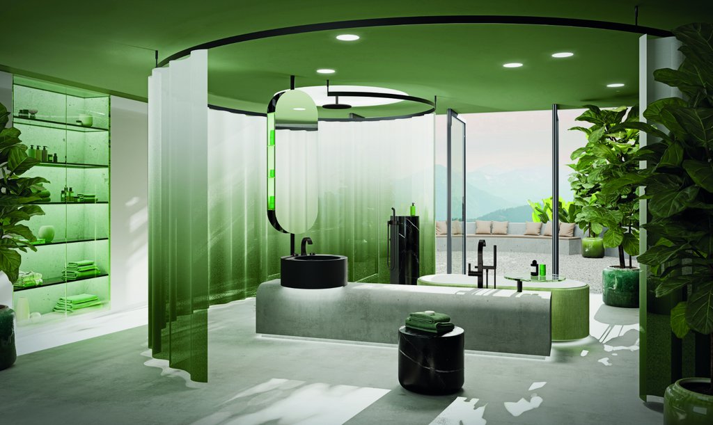
decision – then you just live surrounded by white. But I can just as easily live surrounded by blue. I’ve never got sick of trees being green!
Can using colour in the bathroom be sustainable?
Especially with the new systems and surface-mounted washbasins that were
recently presented at the ISH, it’s possible to work with colour without it posing
a major risk. And then if the time really does
come when you’re tired of seeing the surface-mounted basin, you can remove it. But I’m convinced it’s entirely feasible to
come up with a sustainable colour design that will last for at least 50 years. That’s my opinion. You don’t have to go as over the top as they did back in the 1960s.
One final question: which colours will play a role in designing bathrooms in future?
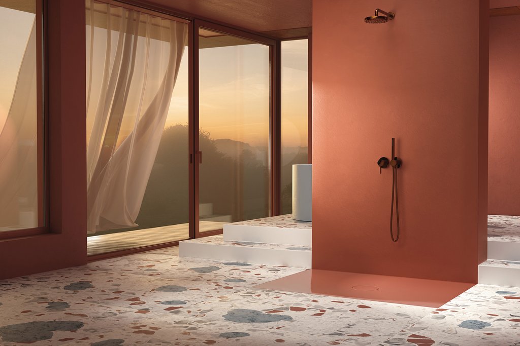
I think it’s true to say that there are always certain trending colours. Right now, for instance, shades of Bordeaux and
red are making a bit of a comeback. They’re
natural, grounded colours, as if somebody had thrown a handful of earth into
the paint pot. It gets difficult when a trend
forecast names a specific colour value, because the colour will look different
in each individual context.
