Instinct and knowhow: the secret to choosing the right colours
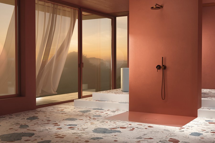
A real alternative to chrome fittings and white porcelain: black shower fittings and the new terracotta as shower tile and wall colour, perfectly coordinated with the splashes of terrazzo.
Photo: Bette - Background: VDS, FAR.consulting

Dr. Hildegard Kalthegener - Farbstudio Dr. K
“Colour is all I know!” – this is how Dr Hildegard Kalthegener sometimes jokingly summarises her career as a sought-after colour expert and designer. She fell in love with colour early in life, first painting pin badges, lamps, door fittings, guitars and bicycles at home, using her talent to buy her first hi-fi system at an early age.
Decades later, the designer wrote her PhD thesis on the correlations between artistic creativity and rationally comprehensible reasoning in terms of colour choices. For many years, she has also worked in theoretical and practical contexts as author and lecturer in the fields of design, marketing and architecture, throughout Germany and Europe, but sometimes also in Asia.
Dr Kalthegener’s clients come from the retail and manufacturing sectors in the furniture, paint, flooring, kitchens and supplier industries. Further customers include design studios and firms of architects as well as universities and industry associations.
Colour is totally on trend in the
bathroom again. And that
doesn’t just apply to the floor, walls and ceiling – the fittings and ceramics,
washbasin and tiles, shower and bathtub are colouring up too. But how do
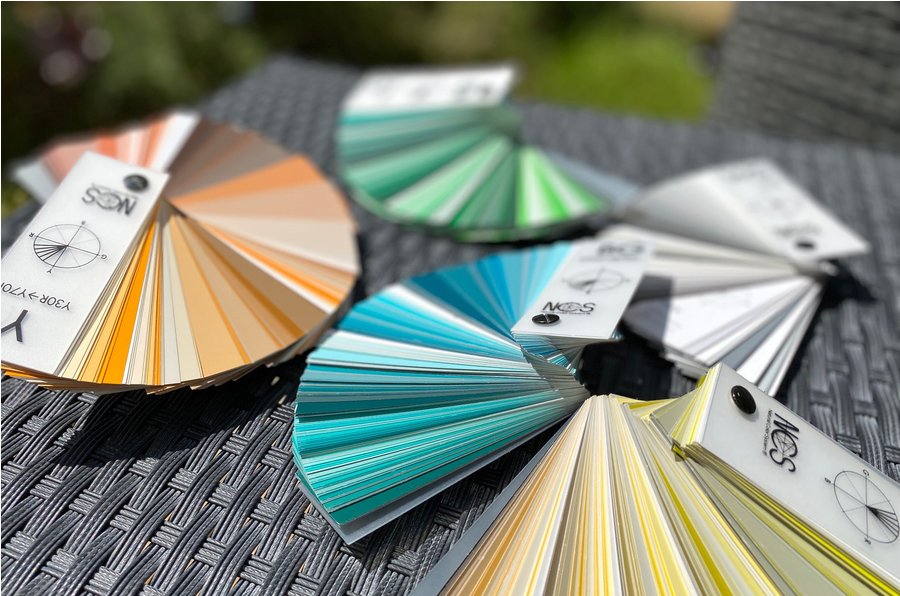
the right colours go together, and what’s behind colour standards like Pantone,
NCS and RAL? Which
colour trends are in keeping with customers’ tastes in 2022 and how can they be
used for bathroom planning? Colour expert Dr. Hildegard Kalthegener answers
these and other questions in our guest article.
A new bathroom doesn’t just have to function, it has
to spark enthusiasm, be attractive and please its owners too. Colour
consulting and selection in the preliminary stages of the project is an aspect
that plays a crucial role in that. It shouldn’t be left to the painter:
that would be a big risk, because painters aren’t bathroom experts. And the
client is an amateur in this area too. They’re not sure whether colour is appropriate
for an investment on the scale of a new bathroom, and if it is, which one? Perhaps they
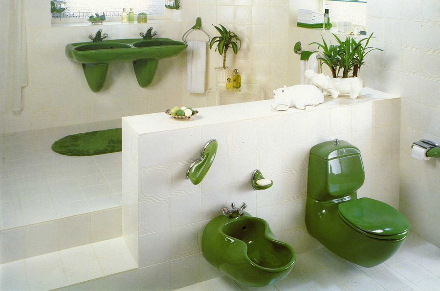
can still see their parents’ pea-green tiles or Bahama Beige basin from the
1970s in their mind’s eye and shudder at the memory? No wonder
they have a pronounced case of chromophobia (fear of colour)! Nowadays,
however, for cases like these and others besides, there’s even a special fan
deck with colours for sanitaryware.
Colour trends through the decades
The revolutionary changes of
the 1960s and 1970s extended to colour too. Since then,
preferences have changed again and again, until everything was first beige and
then white so as to avoid any risk of mistakes. In interior
décor, white temporarily gave way to a big red wave, before lime green climbed
to the very top of the colour industry’s ranking between 2000 and 2010. After that,
things quietened down again, and a big achromatic wave rolled over us: grey. At the same
time, powder pink came into play and began playing an important role in
marketing. But
for most customers, of course, it doesn’t come into question for large areas
and long-lasting bathroom ceramics because it’s too cute and too one-sided (in
the sense of too feminine).
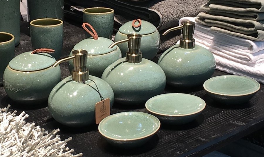
Pea green, Amazon green and lime have been superseded
by sage and eucalyptus, two light and subtle nuances that have been popular for
some time now. They are close to nature rather than loud, and therefore much more in
keeping with the zeitgeist in recent years. They have been
spotted in virtually every exhibitor’s décor at the international furniture
fairs and have even made it onto the fronts of fitted kitchens. But there’s
one thing that colour has to convey more than anything else – and that doesn’t
just apply to short-lived decorations and textiles: today, even wall paint and
long-lasting, high-quality (bathroom) furniture has to express sustainability. And what
better and more obvious way to achieve that than with the clever use of green
in the right shade? In the meantime, even the occasional manufacturer of
built-in elements for the bathroom is joining in. The freshly
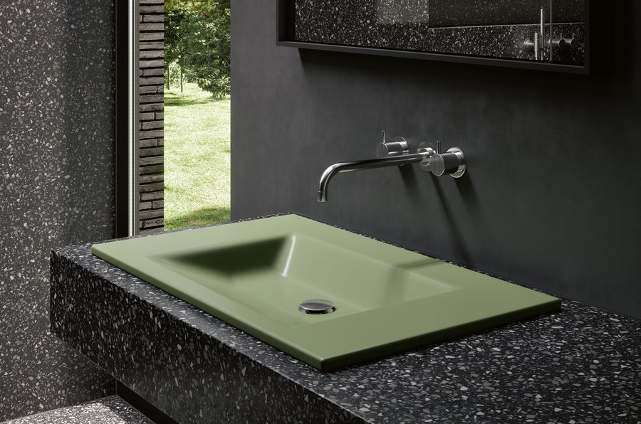
reworked built-in vanity top from Bette, for instance, is particularly on
trend. It
goes by the name of Evergreen and is shown in combination with a countertop
made of dark grey, finely speckled composite stone and water-repellent wall
paint.
Besides Amazon green, terracotta has developed a
totally new life of its own as well. Having been disparaged as
old-fashioned for decades it reappeared in mid-2021, making a dazzling entrance
in the form of the non-porous Bette-Air shower tile in glazed titanium steel. The shower
surface looks particularly expressive when combined with matt black fittings on
a wall painted in a perfectly matching shade of terracotta. The ensemble
is surrounded by elegant multicoloured terrazzo with extra-large aggregates. In this case,
the new terracotta shade is called “Carneol”, but the shower tile is also
available in 30 other colours.
Making the most of colour design as a (consulting) opportunity
In bathroom showrooms, colour is a subject that is
often given insufficient attention. I think that’s a shame, because it’s
actually a great opportunity for the consultation and sales conversation with
the customer. Not using colour design as a topic is a missed opportunity. Colour has a
strong influence on mood, shapes customers’ preferences and can steer the
purchase decision in many different areas. Today’s
clientele is discerning and better informed than ever before, not least of all
when it comes to colour trends and bathroom design.
Customers
have done a lot of reading and research, but they don’t have our experience and
that makes them insecure. So if we want to be convincing, we need to strengthen
our skills, use them cleverly and be one step ahead when it comes to colour trends
as well. That
doesn’t mean anybody who shows an interest in the subject has to end up with
the kind of bright, multicoloured look familiar from preschool classrooms, but
if a customer likes colour and isn’t sure what to do, we need to be prepared to
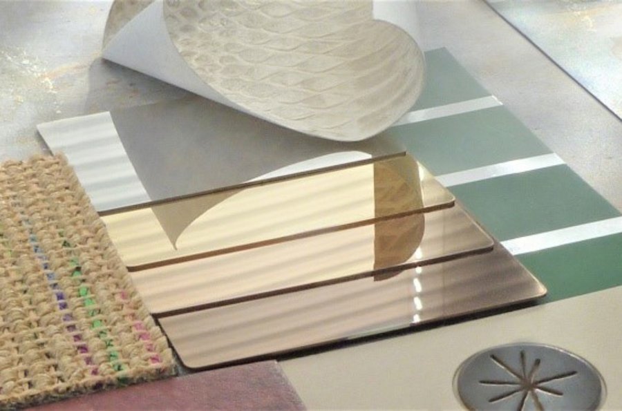
provide competent assistance. Besides a wide range of fan decks and colour
systems, there are plenty of good, clear arguments that can be learned quickly
without having to take a university course in design. Colour has
the potential to turn any bathroom into a very special, personal space.
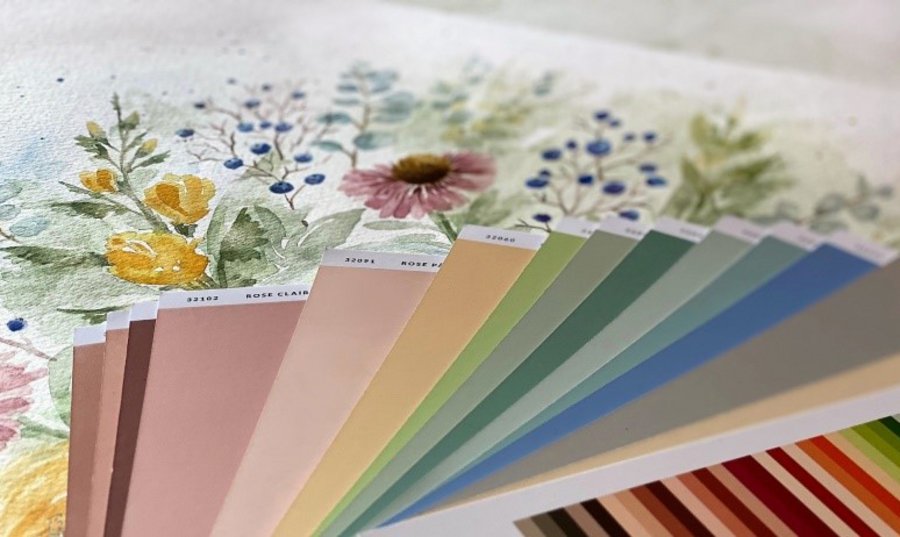
Small collections with around
30 to 100 selected shades and fan decks with big swatches are particularly
helpful and very popular right now. Some only have one colour per page,
which makes it easier to imagine that particular shade in the room than when
you see 10 tiny samples on one page of the fan deck all at once, which can be
overwhelming. These premium fan decks aren’t often found at DIY stores, but they’re a
quick, visible and tangible way for architects, bathroom planners and the
specialised trade to communicate their specialist knowledge to customers.
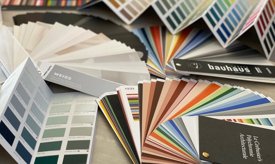
The colours from the Polychromie
Architecturale palette developed by Le Corbusier have stood the test of almost
a century. But
there’s also a colour collection based on the design principles of the Bauhaus,
one of the biggest architecture and design institutions in history. Special decks
featuring every shade of white or a “black fan” are also useful tools and can
be purchased from e.g. Caparol or Sikkens without breaking the bank. The customer
isn’t usually familiar with these fan decks and is therefore easily impressed
because having one colour per page is a real help when it comes to making the (only
seemingly easy) decision as to which shades of white, grey or black are the
right ones.
The latest colour trends
Having a clear opinion about colour trends is a good
chance to demonstrate that you’re well informed and up to date. Since the
beginning of the year, much has been said and written about “Very Peri”, but
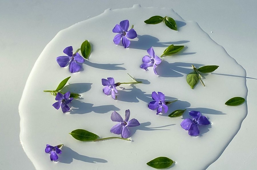
what is that exactly? The name is derived from “periwinkle”, the
ornamental plant that some might know by its botanical name Vinca minor.
It was the small, unobtrusive
violet-blue flowers of the evergreen plant that gave its name to the Colour of
the Year 2022, declared by the Pantone Institute – one of the world’s three
biggest providers of colour samples – after careful research and much
discussion within its trend research team. While this
colour is quite a good fit with the current zeitgeist if used for textiles in
the fashion industry, decorations in interior design, cosmetics and perhaps
even paint on one wall, it is sadly less suitable for use on large surfaces in
the house or bathroom.
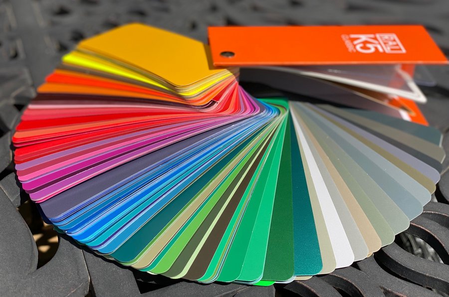
Besides the American Pantone system, there are two
other major international colour standards: the Natural Colour System (NCS),
which is Swedish, and Germany’s RAL system. The trend
predictions of these two institutes span five to 10 colours per year, mostly for
four different trend topics. This makes them considerably more complex and
relatively abstract, so they don’t get as much attention from the general
interest press. However,
they tend to get more attention from those with a professional interest
in colour, mostly designers and architects.
Whereas Pantone, NCS and RAL produce colour standards,
fan decks and samples but not a single bucket of paint, the paint industry –
both in Germany and around the world – is very active when it comes to trends. In Germany,
there’s no particular tradition of naming a colour of the year, but major
German paint manufacturer Caparol has nevertheless selected “mauve” for 2022 –
a pink
inspired by mallow flowers: light, cheerful and subtle, but definitely on the
feminine side.
Nature isn’t all that’s green
When it comes to assessing developments, a look across
the pond can be helpful. In 2022, the American paint industry’s top trends
are very clearly dominated by shades of eucalyptus and sage as Colours of the
Year, even if they go by different names, e.g. “Evergreen Fog”. Other Colours
of the Year in the USA go by the names of “October Mist” and “Breezeway”. Dutch paint
maker Akzo, on the other hand, (Sikkens is its German subsidiary) was inspired
to its pale blue Colour of the Year by “Bright Skies”, whereas Sigma, a German
paint firm with an American parent company, completes the colour wheel in the
eucalyptus direction with the silvery green of “Olive Sprig”.
What all the above-mentioned
shades have in common is that, in a time where nobody really knows what’s next,
they are light, friendly and muted, slightly hazy and airy. But one thing
that’s clearer than ever before is that nature has an important role to play in
a future where sustainability is key, which is why light, greyish shades of
green remain a safe choice for the bathroom too. There’s no
need for it to be the sanitaryware: quiet shades are an attractive choice for
wall paint or a tiled wall as well. So why are international paint
companies relevant for German bathroom planners, or anyone else whose work
focuses on projects in their own region? Because the
paint industry researches the global mood and the associated colour preferences
very thoroughly. It spends huge sums of money on marketing the
respective Colour of the Year, and that goes for national subsidiaries of
international companies too. What’s more, as a product with a longer lifespan,
interior paint colours are obviously much closer to the colour trends in the
bathroom than the short-lived seasonal favourites seen on international
catwalks.
How long does a colour actually stay on trend?
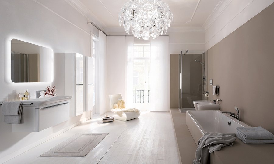
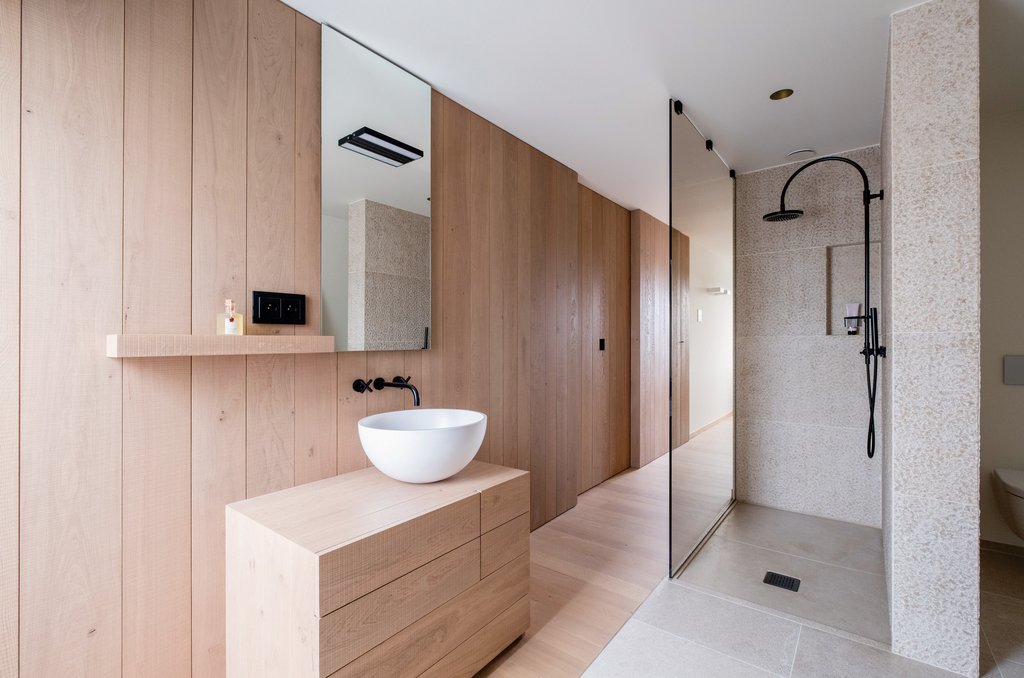
Uncoloured nuances around alabaster, clay and linen are a safe choice for bathrooms and fitted kitchens, in fact for all objects that stay in the house for a long time.
Photo: Geberit
In the kitchen, bathroom and architecture the trend
wheel turns slowly – which is understandable in view of the long-term
investments involved. Roughly speaking, the average German consumer
buys a new fitted kitchen every 10 to 20 years. And they
don’t usually paint the outside of the house or renovate the bathroom any more
often. When
they do, they want to be sure they’re getting it just right, not undertake a
bold experiment. So when so many major paint companies are reaching
such similar conclusions when it comes to determining which colour matches the
current zeitgeist – which hasn’t happened very often, by the way – you can be
pretty sure that this trend will last considerably longer than a year, i.e. the
development described here will endure beyond 2022.
Anyone who thinks it’s too risky to use colour for the
long-lasting products can use the “Colour of the Year” in their advertising and
decorations or as an eye-catching display in the showroom so as to create an
appetite for a breath of fresh air in the bathroom, regardless of whether they
opt for “Very Peri” or eucalyptus as an evergreen option. Do we have to
follow the trend? No, of course not, but taking note of the most basic
results the trend researchers come up with helps make the most of every
opportunity when it comes to creating a contemporary, attractive and successful
design – not just for customers’ bathrooms, but for your own showroom as well.
This article first appeared (in German) in the trade
journal SBZ (trade journal for sanitary, heating and air conditioning).
