Behind the scenes: Pop up my Bathroom logo - Variety means individuality

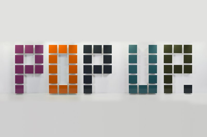
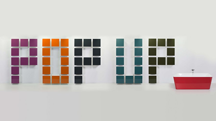
The new logo for Pop up my Bathroom, the award-winning international campaign by the German sanitaryware industry, focuses on the vast amount of freedom today’s consumers have when it comes to planning an individual bathroom: the distinctive “Pop up.” wordmark is made up of 54 cabinets in different colours to create a pixel-like effect.
A communications campaign that observes and visualises what’s trending in bathroom culture and design has to keep reinventing itself. After about six years, it was time to rework the logo for Pop up my Bathroom. And when it came to devising the new concept, individualism – the motto of the 2017 campaign for the ISH – played a major role in the deliberations.
How can a successful logo be reworked without forfeiting the original idea of modernity and unusualness? How can the Pop up my Bathroom brand name, which has already established itself in the industry, be abbreviated without giving up the campaign’s innovative orientation? And how can the central themes, which change with every campaign, be accommodated accordingly? Whereas previous editions of the trend report used changing colours and an accompanying key visual to distinguish the respective ISH year, the current campaign turns the logo itself into the message and translates the central theme into a visual.
This year’s Pop up my Bathroom motto shines a spotlight on the individualism megatrend, which has a particularly long-lasting effect on the bathroom. That’s because, more so than any other room in the house, the bathroom has to be adapted to its users’ individual needs so as to meet modern expectations of wellbeing, wellness and independence in old age. But it is also a space where individualism poses a greater challenge than anywhere else in the house – a challenge that the sanitaryware industry and trades have largely mastered. In the meantime, consumers can choose from an almost infinite number of solutions for their new bathroom.
This huge variety of options is now visualised in abstract form by the logo. Besides shortening the name of the campaign to Pop up, it features a wordmark made up of products from exhibitors at the ISH 2017 and member companies of the German Sanitary Industry Association (Vereinigung Deutsche Sanitärwirtschaft e.V. [VDS]). Art director Karsten Jipp achieved the desired effect by breaking the individual letters down into squares. And with Hewi’s new M 40 bathroom furniture – a modular system that is ideal for creating individually designed bathrooms, be it an understated designer look, a comfortable and convenient family bathroom or a barrier-free space – the new Pop up my Bathroom could actually be built.
That’s because the Hewi bathroom furnishings can be individually configured: separately, horizontally or vertically. The M 40 system can be arranged and added to as required, fuelling ambitious planning ideas and opening up a wealth of design options. The individual elements can be arranged side by side or one on top of the another. Eleven glass colours, two depths and four heights provide countless possibilities.
These design options have now been implemented in the form of a 3D product collage. Each letter is a different colour. And by the way: it’s not just sanitaryware manufacturers who are taking a bold new approach to colour: a growing number of homeowners who want to redesign their bathrooms are doing the same. The bathroom is becoming more colourful and thus more individual as well. Villeroy & Boch even allows consumers to personalise their bathtub: made of Quaryl, the freestanding Squaro Edge 12 bath is available in any shade imaginable. The Pop up my Bathroom logo uses Squaro Edge 12 in a beautiful, subtle shade of red toadd the finishing touch – and the bathtub to Pop up.
The walk-round logo is ten metres long and will be set up in the foyer of Hall 4 as part of the Pop up my Bathroom trend forum at the ISH 2017.